
Before you hit publish on your website, you need to double-check a few critical things, for instance, from making sure that there are no spelling or grammatical errors to optimizing how your site looks on mobile browsers.
This blog will show you five critical things you need to double-check before publishing your site so that nothing slips through the cracks.
To begin with, on number 1, we see
Security Checkpoint: Is Your Website Secure?
It’s essential to ensure your website is secure before you publish it. Here are five things you should check:
1. SSL Certificate
Make sure to install SSL certificates on your site. It is highly significant to ensure your website’s security. Moreover, this will encrypt communication between your website and visitors, making it more difficult for hackers to intercept data.
2. Web Application Firewall
A web application firewall (WAF) can help protect your website from attacks. It lies between your server and visitors. Moreover, it monitors traffic and filters out malicious requests.
3. Password Protection
Don’t forget to password-protect any sensitive areas of your website, for instance, the admin area. It would be best to use strong passwords that no one can guess. Moreover, you can consider using a password manager to track them.
4. File Uploads
If you allow file uploads on your website, check them carefully for viruses before allowing them to be downloaded by others. It can help prevent malicious code from being injected into your site.
5. Backup Your Site
Finally, remember to back up your website regularly. This way, if something goes wrong, you’ll be able to restore it quickly and easily.
Moving on to number 2, let us see
Usability Checkpoint: Are Your Web Pages Readable and Easy to Navigate?
Web Pages that are difficult to read or navigate can be frustrating for users and may cause them to leave your site. In other words, the readability score is directly proportional to your site’s reader retention rate.
Here are some things to consider when assessing the usability of your web pages:
1. You should always use a font size and typeface that is easy to read.
2. The overall layout of your webpage should be clear and easy to follow.
3. Navigation should be easy to find and use.
4. Links should be clearly labeled and easy to click on.
5. Forms should be simple to fill out and submit.
Coming down to number 3, let’s mention
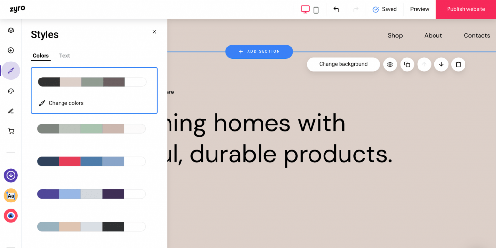
Style Guide: What Fonts, Colors, and Font Sizes Do You Need?
You must remember a few critical points about style guides for your website.
Consistency
Firstly, you should ensure that the fonts, colors, and font sizes you use are consistent throughout the site. Thus, it will give your website a cohesive and similar look and feel rather than a patchy, irregular, and messy look. Moreover, it will impress your visitors and leave a positive impression of your site.
Fonts
In terms of fonts, there are a few main types that you should consider using on your website. Sans Serif fonts like Arial or Helvetica are generally best for body text. These fonts are easy to read and provide a clean look for your site. Consider using a Serif font like Times New Roman or Georgia for headlines and other larger text. These fonts have more decorative details that can help add visual interest to your site.
Colors
You’ll want to choose a limited palette that compliments your brand identity when it comes to colors. Stick with 2-3 primary colors and 1-2 accent colors. Moreover, be sure to use shades of these colors to work well together. For example, if your primary color is blue, you might use light blue for headlines and dark blue for body text.
Font Sizes
As far as font sizes go, there is no hard and fast rule. However, it’s generally best to use larger fonts for headlines and smaller fonts for body text. It will help ensure that your visitors can easily read the content on your site.
So there you have it! These are just a few things to recall when creating a style guide for your website. By following these guidelines, you can create a cohesive look and feel for your site that will appeal to your target audience.
Moving on to number 4, you should see:
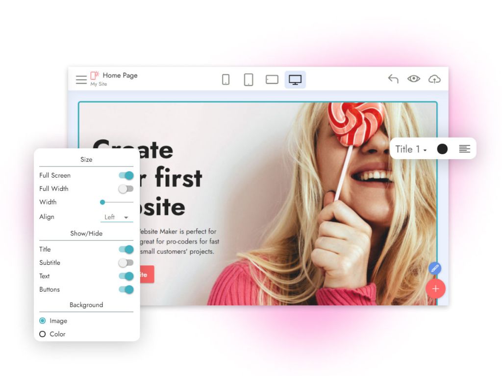
Mobile Strategy: Is your website mobile compatible?
Your website must be designed with a mobile-first approach because more and more internet users access the web from their mobile devices. In other words, you should create a responsive design that adapts to smartphones and tablets with smaller screen sizes and touch-based input.

If your website isn’t mobile-friendly, you could miss a lot of traffic and potential customers. Moreover, Google’s search algorithm now also favors mobile-compatible websites. So if your website needs to improve, you could be in a better place in the search results.
Therefore, creating a mobile-friendly website has become integral to any digital marketing strategy. Don’t let your business fall behind by neglecting this important aspect of your online presence!
Coming down to our last checkpoint on number 5
Proofreading Checkpoint: Have Someone Else Look Over Your Work Before It Goes Live
Before you hit the publish button on your website, you must check to ensure everything is working and looking the way it should. This proofreading checkpoint is essential to avoid any embarrassing typos or errors on your site.
For this purpose, you can ask a friend or colleague to review your site before publishing it. They can catch any errors that you may have missed. Moreover, you should avoid mistaking elements like spelling, grammar, and broken links.
Making sure your site is error-free before launching will give visitors a better experience and make a good impression of your business.
Conclusion
Congrats on publishing your site, but you need to pause and double-check the above points, so you don’t have to worry after publishing the site.
